会話形式の吹き出しを作りたいなーと思っていたら、
こんな記事を見つけました。
なにこれ!すっげ!超良いじゃん!
って思って実装したんですが、
レスポンシブデザインだと、
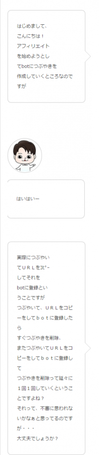
てな感じでぶっ壊れてるんですよ。
右の人いないんですよ!
スマホには対応しておらぬのか、と探してみたところ。
【応急処置】WordPress Stingerテーマで「フキダシ風会話」のCSSを修正
を見つけたんですが、それでもちょっと崩れているんですよね。。。
なのでレスポンシブ対応を書いてみました。
HTML
HTMLはそのままです。
<div class="question_Box">
<div class="question_image"><img src="画像のURL" alt="質問者の写真" width="90" height="90"/></div>
<div class="arrow_question">
     ここに会話内容
</div><!-- /.arrow_question -->
</div><!-- /.question_Box -->

<div class="question_Box">
<div class="answer_image"><img src="画像のURL" alt="解答者の写真" width="90" height="90" /></div>
<div class="arrow_answer">
     ここに会話内容
</div><!-- /.arrow_answer -->
</div><!-- /.question_Box -->
CSS レスポンシブ対応
/*============================================================
フキダシデザイン
============================================================*/
.arrow_answer,
.arrow_question {
    position: relative;
    background: #fff;
    border: 1px solid #c8c8c8;
    padding: 20px;
    border-radius: 10px;
    width: 55%;
    float: right;
}
.arrow_question {
    float: left;
}
.arrow_answer:after,
.arrow_answer:before,
.arrow_question:after,
.arrow_question:before {
    top: 50%;
    border: solid transparent;
    content: " ";
    height: 0;
    width: 0;
    position: absolute;
    pointer-events: none;
}
.arrow_question:after,
.arrow_question:before { right: 100% }
.arrow_answer:after,
.arrow_answer:before { left: 100% }
.arrow_answer:after,
.arrow_question:after {
    border-color: rgba(255, 255, 255, 0);
    border-width: 15px;
    margin-top: -15px;
}
.arrow_answer:after { border-left-color: #fff; }
.arrow_question:after { border-right-color: #fff; }
.arrow_answer:before,
.arrow_question:before {
    border-color: rgba(200, 200, 200, 0);
    border-width: 16px;
    margin-top: -16px;
}
.arrow_answer:before { border-left-color: #c8c8c8; }
.arrow_question:before { border-right-color: #c8c8c8; }
.question_image { float: left;
                  margin-right; 5px;
                  width: 20%;
}
.answer_image {
    float: right;
    margin-left: 5px;
    width: 20%;
}
.question_Box {
    margin-bottom: 25px;
    overflow: hidden;.arrow_question
}

.answer_image img{ border-radius: 50px; float: right;}
.question_image img { border-radius: 50px;}

@media only screen and (max-width: 767px) {
.arrow_question {
float: right;
}
.arrow_answer {
float: left;
}
}
主に修正、追記したのは、
画面が小さくなった時に、floatの方向を反転させるコードです。
その結果!
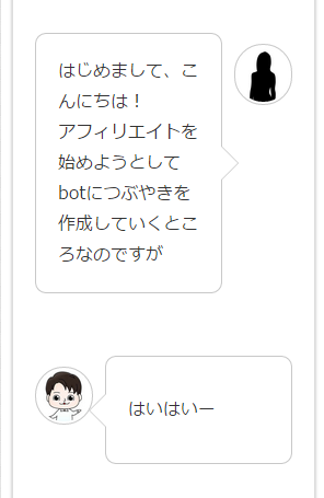
右の人出てきた!
でもちょっとかぶってる!!
でもさ、俺元々ちょっとかぶってるし
これくらいはしょうがないと思うの。
神様が、土屋はこれくらいはかぶってないとダメって言ってるんだと思うの。
なんにせよ。
予は満足じゃ


コメントを残す